
A Mobile App that replaced Offline B2B Sales over endless back and forth and phone calls
Why this Mobile App needed to be built?
A business customer who wanted to add 10 staff mobile lines had to call a rep. A company wanting to upgrade their broadband had to wait for a back and forth installation availability. There was no app, no online portal, no self serve purchasing of any kind. Every friction in the steps caused a lost sale.
An App was needed that could solve
Product Selection -> Order Placement -> Schedule Installation -> Support
My Role
Senior UX Designer
Platform
B2B Mobile App
App Live on
IOS & Android
Scope
Inception -> Launch
First in MENA
App Store + Google
Offline → Online
What were the challenges in designing the app?
• The product portfolio problem: 9 service categories, each containing multiple products, with its own plan tiers, add ons, and instalment options.
• The user confidence problem: Operations Managers, IT leads, and business owners making considered decisions for their teams; any confusion or ambiguity risks losing an entire enterprise contract.
• The blank canvas problem: No telecom company in the MENA region had built a B2B e-commerce app before. There was no benchmark, no established mental model to design for.
My Responsibilities
I led the Discovery & Industry benchmarks like Ali Baba, Global Sales, Amazon.
I owned the Customer Journey & Mapping to explore opportunities for pain points.
I designed core flows that shipped to the App Store and Google Play in a team of 3.
I collaborated with engineers and POs and provided detailed Hand Offs.
I designed Mobile Application's logo and App Store creatives.
Mapping the full journey revealed how businesses explore, compare, and purchase B2B products.
The friction points made us design mobile experience for more clarity.
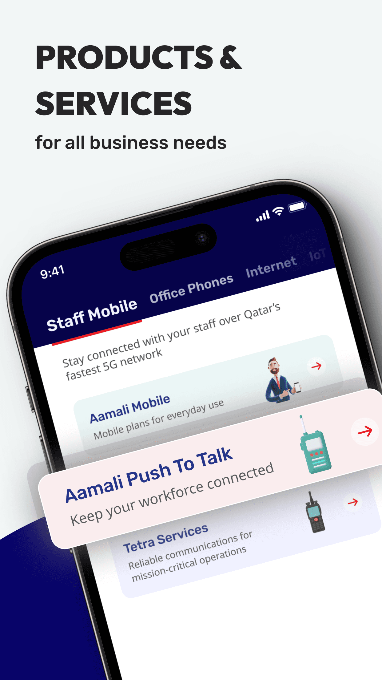
Designing the Product Browsing System
This structure supports ongoing product expansion and simplifies navigation for both new and existing telecom services.
We implemented a tab-based browsing system for effortless exploration of product categories and services, keeping users from feeling overwhelmed.
A major challenge was organizing Ooredoo’s large add ons product portfolio in a way that remained easy to navigate and scalable as the platform grows.
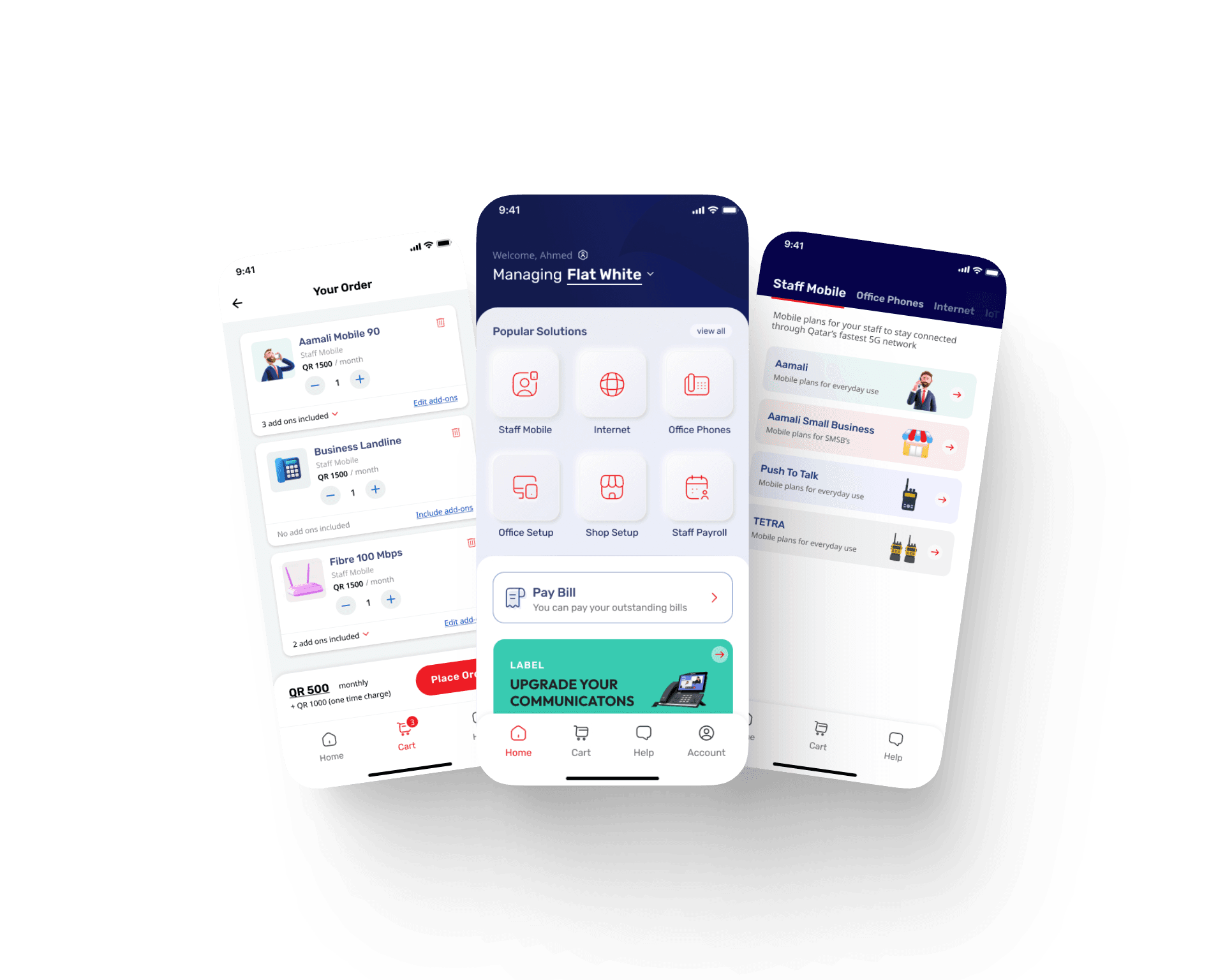
Purchase Funnel.
The B2B app follows familiar e-commerce steps: Home → Product Portfolio → Plan Selection → Cart → Add-Ons → Checkout, adapted for telecom complexity.
Plan Cards.
Users browse features and add services to cart, with add-ons offered post-selection for upselling and customization.
Add-On System.
Tabs allow businesses to quickly find add-ons like minutes or data. Users can skip add-ons to continue.
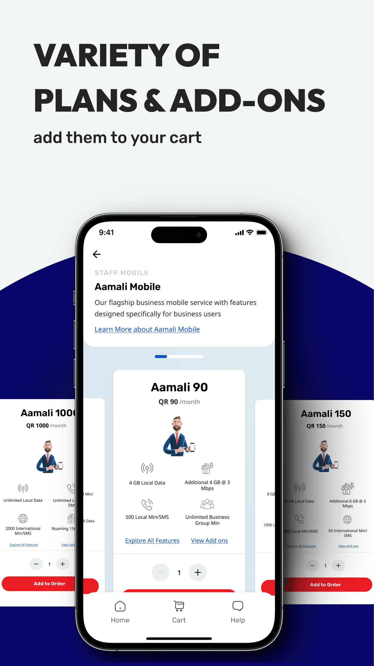
How to design for preventing Feature Overload?
To prevent feature overload, we introduced a flip-card interaction for detailed plan features, retaining a minimalist layout while giving users easy access to in-depth information.
Designing for Comprehensive Cart Total Pricing
A comprehensive breakdown shows payments due today, recurring monthly costs, and installment payments, allowing businesses to understand their financial commitments clearly.
This transparency was essential for building user trust in a complex purchase journey. to make them repeat customers
Designing for the main USP of the app: Checkout & Scheduling Installation
Checkout was streamlined to minimize churn while capturing essential installation details. Businesses can schedule installation dates and confirm their location using an integrated map pin system.
This ensures accuracy and speeds up post-purchase service delivery.
What I learned
“B2B users are not intimidating. The product complexity was. My job was to make 9 categories of enterprise telco feel like something a busy Operations Manager would actually want to browse on their phone and every design decision I made was in service of that one goal.
What this project taught me most was that CRO principles do not belong only to consumer e-commerce. Reducing friction, placing upsells at the right moment, building price transparency into the flow; these are just as powerful, if not more so, where the stakes of every purchase are higher.”
Bisma
View Full Case Study?
Want to see the full story? The complete deck includes all research, wireframes, iterations and final designs.
View the Next Case Study ->


© 2026 Design Portfolio All rights reserved. Designed by Bisma Munawar