
The Billing Portal Was Losing Users at Payment Stages. Here Is What Usability and A/B Tests Revealed
Why was it so important to conduct this Usability Research?
Ooredoo's B2B Portal is where business customers manage their services and pay their bills. For companies managing dozens of lines and complex billing cycles this is mission critical infrastructure.
The users were dropping at Billing payment stages on existing portal and the support team was frequently receiving the tickets about payment questions. So, the team designed it and I tested it before rolling it out on Web.
My Role
Senior UX Designer
Platform
B2B Web Portal
Type
Usability Research
Scope
Billing & Payment
120 Tasks Tested
73% Task Success Rate
3 A/B Tests
A usability test is only as
good as the questions
it is designed to answer.
How did I design the test?
Before running a single session I defined four core areas:
ease of use
task speed
feature value
inclusive design
I designed test scenarios around real tasks business customers actually perform:
locating a specific bill
understanding their outstanding balance
making a payment
filtering by billing period
exact journeys that were generating support calls
What I owned
I led the Research Planning including test scenarios for Usability Testing.
I was the lead moderator during the testing.
I led and designed iterations on the designs for A/B testing during interview week for validation in the next interview.
I conducted analysis post interviews and designed the usability testing report based on the results.
I translated anaylsis into prioritised design recommendations.
Jargon Simplification.
The B2B app follows familiar e-commerce steps: Home → Product Portfolio → Plan Selection → Cart → Add-Ons → Checkout, adapted for telecom complexity.
Filter Discoverability.
Users browse features and add services to cart, with add-ons offered post-selection for upselling and customization.

Service Level Grouping.
Tabs allow businesses to quickly find add-ons like minutes or data. Users can skip add-ons to continue.
What did the Testing Sessions Reveal?
One theme emerged above everything else: the language of the portal was completely misaligned with the language of its users.
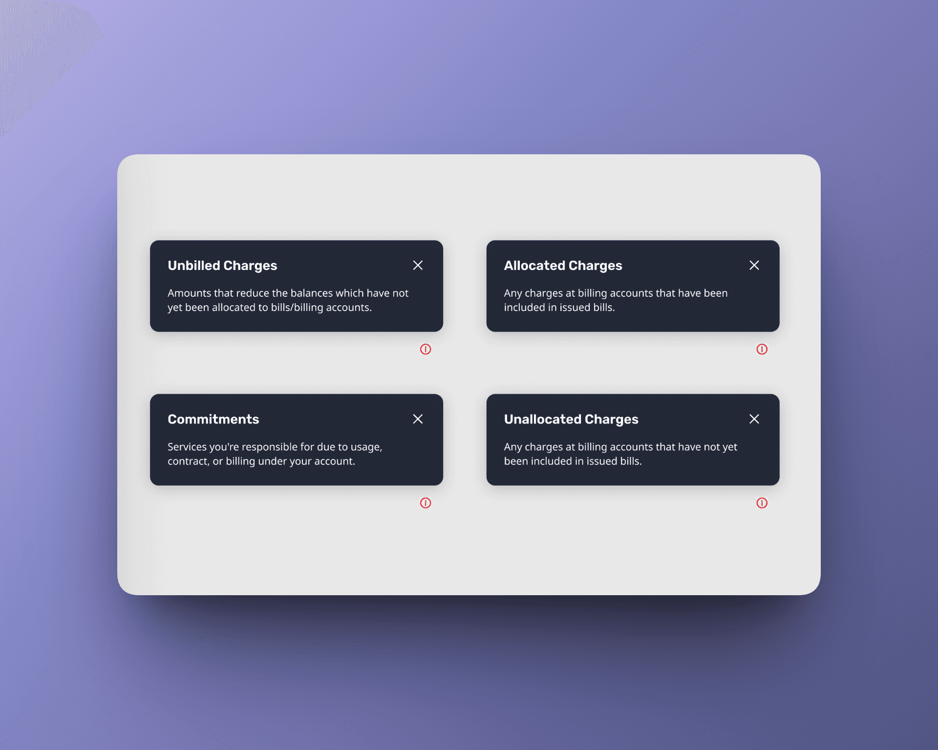
78% struggled with terms like Unallocated, OTC and MRC.
67% never noticed the info icons.
And when we asked every participant what Restricted meant ? 💡100% did not know and upon clarification they all said the same thing: it should just say Suspended. Every participant. Unanimous. That is the clearest design signal.
100% consensus is the rarest finding in usability research.
Moving the Alert Changed Everything in A/B Testing
The critical payment alert was placed mid screen. Only 33% of participants noticed it. I tested moving it to a prominent top banner position. 100% of participants noticed it immediately. This was not a subtle improvement - it was the difference between a critical business alert doing its job or being unseen.
Test A Mid Screen · 33% noticed
Test B Top Banner · 100% noticed ✓
If users do not understand a term, do not hide the definition. Place it where they are already looking
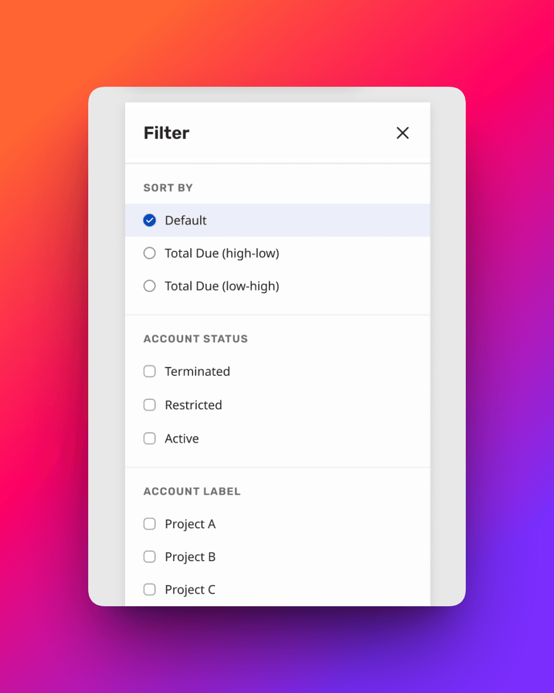
I tested inline definitions: small contextual explanations displayed directly beneath confusing terms, visible without any interaction required.
Without inline definitions 50% understood the term Terminated. With inline definitions 85% understood it immediately. That is a 35 percentage point improvement in comprehension from one small, low effort change.
Test A Without Definitions · 50% understood
Test B With Inline Definition · 85% understood ✓
B2B payment behaviour is not one size fits all. Design for the reality, not the ideal. Challenging an in built assumption
The third test explored whether users wanted partial payment capability only for active accounts or for all account types. 67% wanted partial payment across all account types including restricted and terminated ones. This directly challenged an assumption set into the existing design, and now the design would have to be adapted to reflect the real user's payment expectation, not the assumed one.
Test A Full Payment only · 33% for active and other accounts
Test B Partial Payment · 67% for active and other accounts ✓
What I learned
“This project taught me that the most impactful design changes are often the smallest ones like moving an alert, adding an inline definition, renaming a status label.
One finding that genuinely surprised me that 67% of participants never noticed the info icons that were supposed to help them. The help existed. It was just invisible. Making those icons clickable and more prominent doubled tooltip engagement instantly.
My CRO finding was that 67% wanted to make payments through bank transfers and 33% wanted to use debit/credit card options so such functionality of bank transfer should be weaved in quickly so payments are done faster and users are supported.”
Bisma
View Full Case Study?
Want to see the full story? The complete deck includes all research, wireframes, iterations and final designs.
View the Next Case Study ->


© 2026 Design Portfolio All rights reserved. Designed by Bisma Munawar